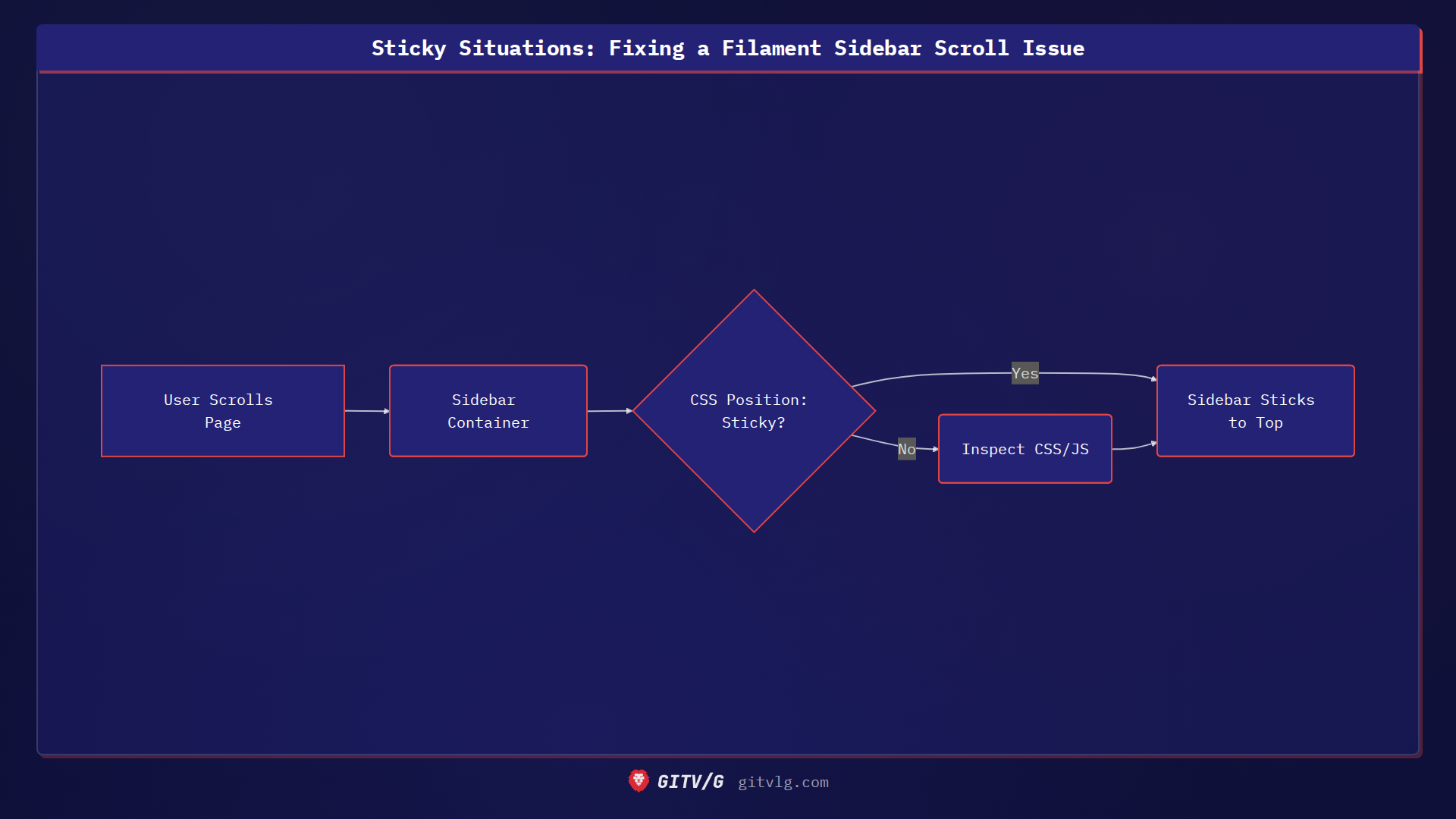
Sticky Situations: Fixing a Filament Sidebar Scroll Issue
Ever felt like a crucial part of your UI just wouldn't stay put? That's the kind of problem we tackled recently in the devlog-ist/landing project, which aims to provide a streamlined blogging platform for developers.
The Problem
The Filament admin panel's sidebar, designed for quick navigation on desktop, was failing to maintain its sticky position during page scrolling. This made it difficult for users to access the menu options, especially on longer pages.
The Cause
The issue stemmed from conflicting CSS rules and Javascript behaviors that were preventing the sidebar from adhering to its intended position as the user scrolled. It's a common problem with fixed or sticky elements when the surrounding layout isn't properly configured to support it. Think of it like trying to tape something to a surface that's constantly moving – it just won't stick.
The Solution
The fix involved a combination of CSS adjustments to ensure the sidebar's container correctly handled the sticky positioning. Here's a simplified example of the kind of CSS that might be used:
.sidebar-container {
    position: sticky;
    top: 0;
    height: 100vh; /* Or a specific height */
    overflow-y: auto; /* Enable scrolling within the sidebar if needed */
}
This CSS ensures that the .sidebar-container sticks to the top of the viewport (top: 0) and occupies the full height. The overflow-y: auto allows the sidebar content to scroll independently if it exceeds the viewport height.
The Lesson
When working with sticky or fixed elements, always double-check the CSS context and ensure there are no conflicting styles. Use browser developer tools to inspect the element's computed styles and identify any unexpected behaviors. Also, be aware of how Javascript might be interfering with the element's positioning, and adjust accordingly. By addressing these points, you can ensure your sticky elements stay exactly where they should.
